Product List Optimization
Mobile focused overhaul of the product list component for Levi.com’s cart and checkout.
SPRING 2024
LEVI STRAUSS
Overview
Over 60% of Levi.com visitors come from a mobile device. Contrastingly, most of the purchases are made on a desktop. Setting aside the common behavior of casually browsing on a mobile device, I also noted several heuristic violations within cart and checkout that would make the mobile experience difficult, negatively impacting the mobile purchase rate. By improving the mobile experience on cart and checkout, we aimed to impact our overall mission to help consumers complete their purchase.
Problem
The product component in cart and checkout had several issues making it harder to easily compare and review due to excessive scrolling, small image sizes and duplicative or unnecessary information, particularly on mobile view.
Metrics
Cart success rate (focusing on mobile)
Cart abandonment rate
Customer Satisfaction Scores: Ease of checking out
Gaining perspective
When starting any complex project, I like to first understand the lay of the land by pulling together industry standards, performing heuristic analysis of the current experience and running stakeholder interviews. In this case, I also worked in tandem with our design system specialist to identify elements with which we could design a pattern to then scale across all experiences, both site and native app.
Hearing from our users
Luckily we had recent studies to leverage from the cart and checkout experience on site. From those we were able to formulate a few themes:
“I can’t see important details”
“I can’t easily compare items when I can’t see multiple items at once”
Identifying the big issues
Image size prohibits recognition and review
Some shoppers may require more review before they are ready to purchase. Images should be large enough to allow shoppers to easily differentiate between similar products.
Items require excessive scrolling
Shoppers should be able to see more than one item at a time, meaning items should not exceed 50% of the screen height.
Content is duplicative or irrelevant
The more information we show on cart, the more friction we provide as we force shoppers to parse through excessive information to find what is relevant to them.
Begin with the basics
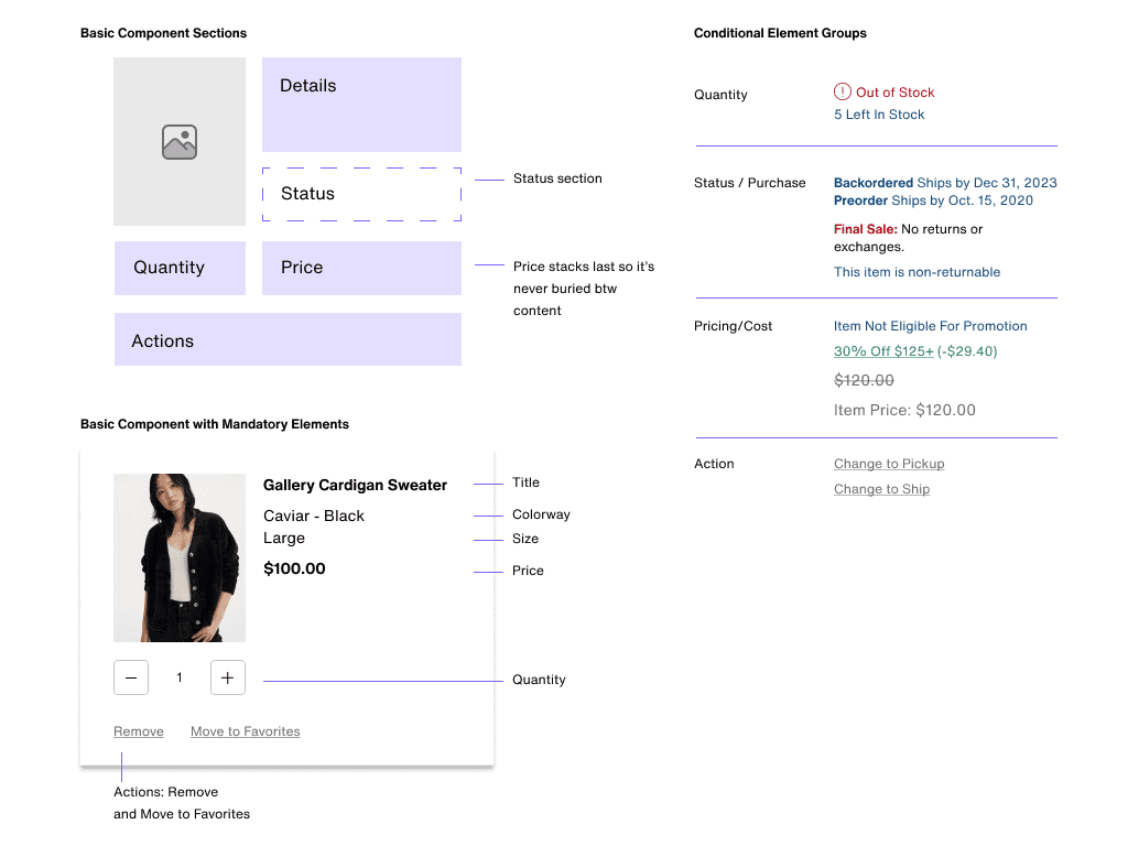
Shoppers are commonly inundated with copious amounts of information as they shop online, but the closer they are to purchasing, the more focused they become in order to feel confident before deciding to finally purchase. I partnered with a user researcher to inform the information hierarchy we used to form the foundation I used for preliminary designs.
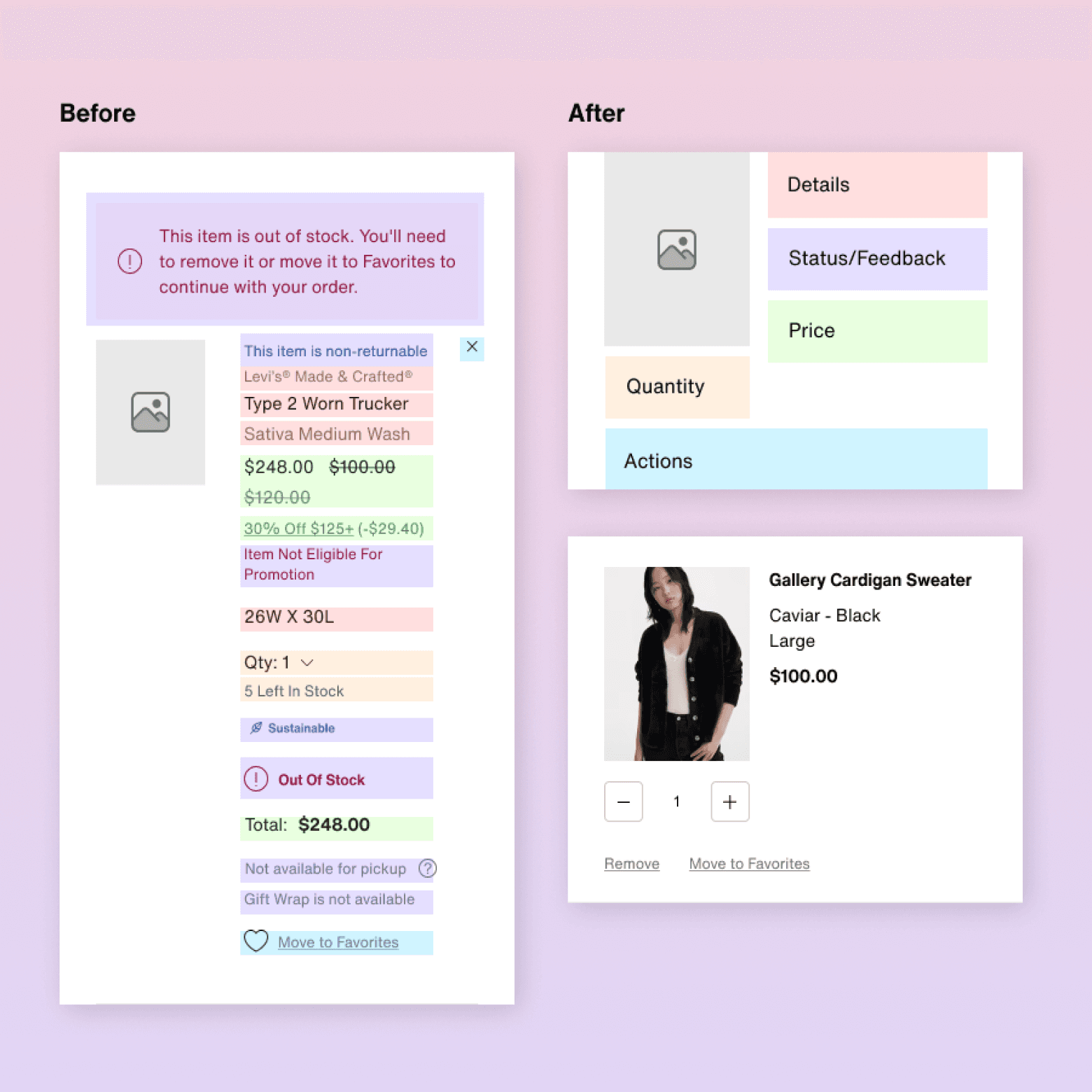
Product details: Name, Color, Size, Image, Quantity
Price: Original price and any applied savings
Actions: Affordances for editing or removing added items
The stress test
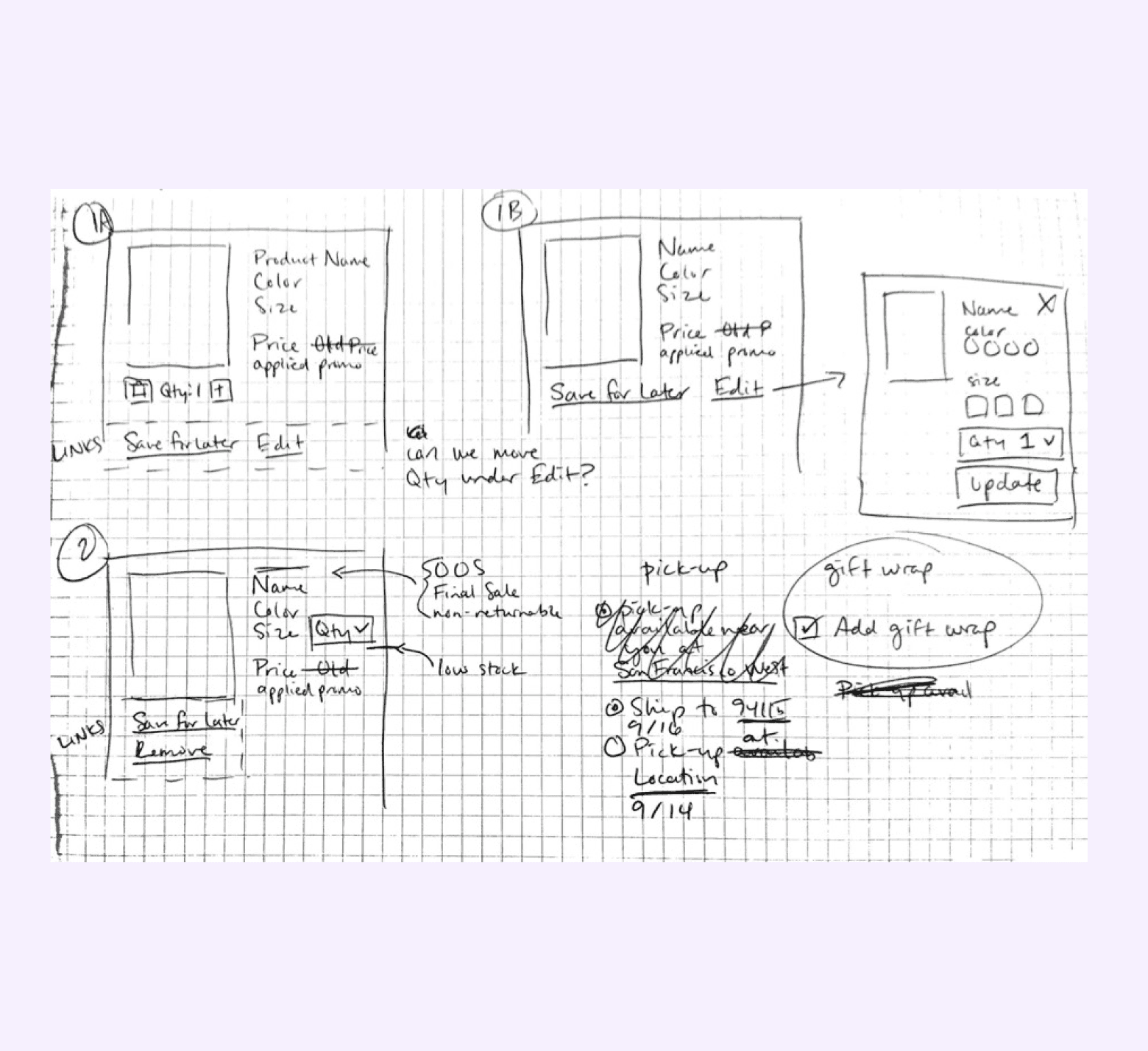
Right after settling on a few preliminary patterns I wanted to continue with, my next step was to test them against a collection of edge cases that I collected during my initial stakeholder discussions and research.
How to display item statuses
Out of stock
Low in inventory
Non-returnable
(future) estimated delivery/pick-up dates
How to display affordances
Remove/delete
Move to favorites
(future) pick-up vs ship options
But how to begin???
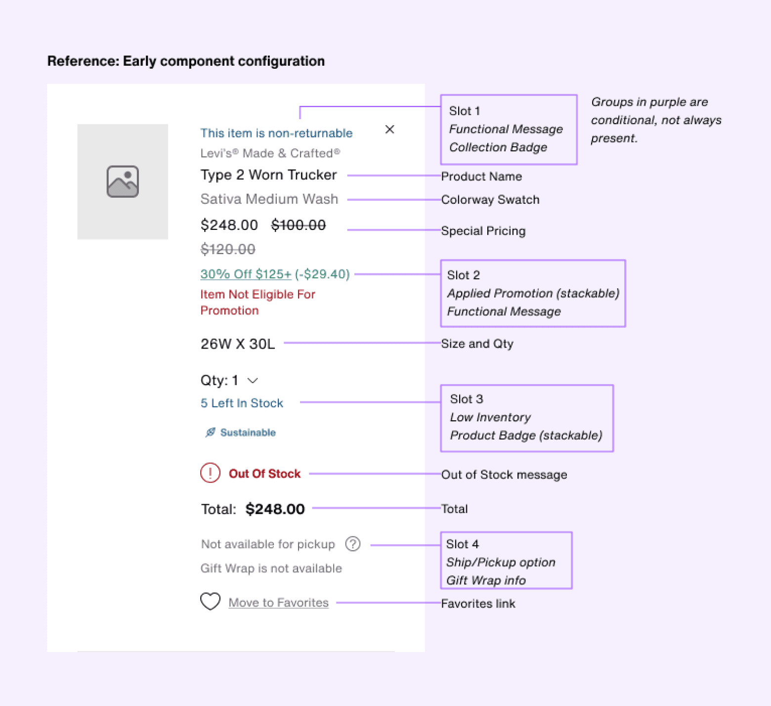
The component we started with was a mess, the order of information nonsensical and unorganized with several competing priorities using color and weight. I wanted to create some order out of chaos.
This process involved close collaboration with my design system partner to ensure the design we ended up with would pair well with our other product list components used in other areas of the site. I was fortunate that during this time we were undergoing some renovations of the design system which allowed me greater flexibility to explore different ideas.
Information Hierarchy
Easy place to start is to group information in buckets. What makes sense, what doesn’t? Are there any outliers, any information that doesn’t fit nicely? Are there elements that seem redundant, or unnecessary? What elements will always be shown versus things that are conditional?
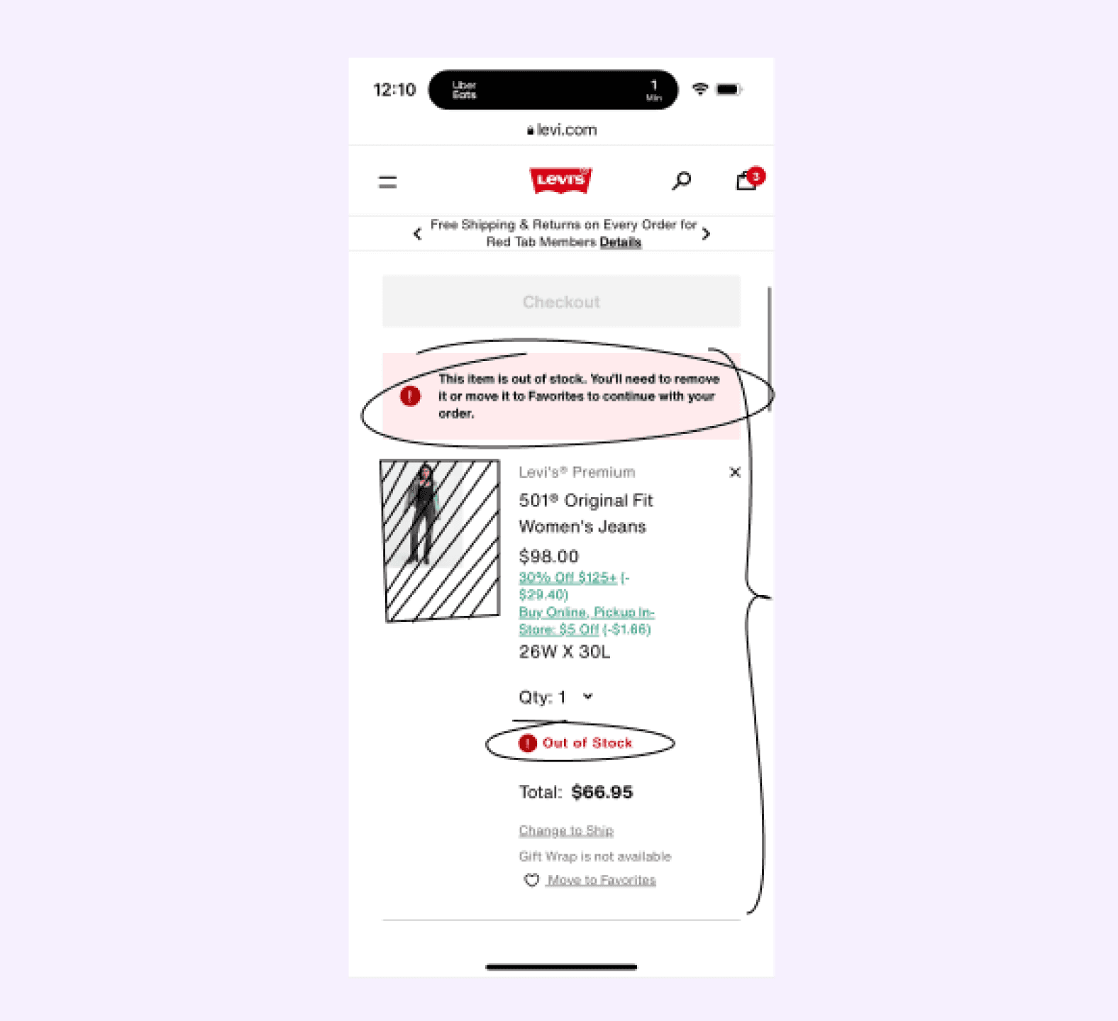
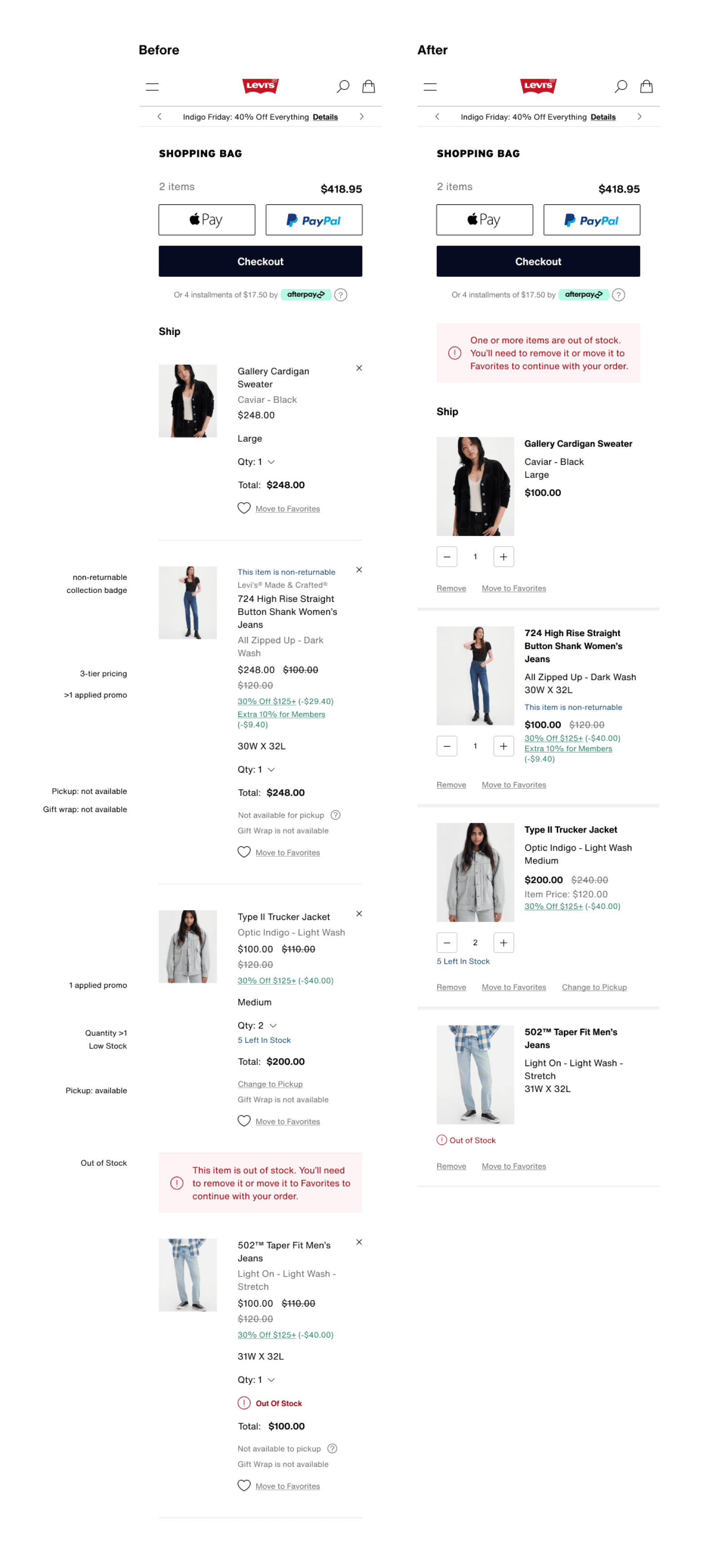
• Out of stock was displayed at item level in two places. Proposed we move the banner to page level to announce all out of stock scenarios and leave the out of stock badge to help users flag the items in question
• Unavailable feature announcements such as gift wrap and pickup options were wasted space. The importance of that information is minimal compared to the rest. Recommendation was to remove them and suggested to stakeholders that in the future we only provide information about these features if it is actionable.
• Spacing, color and emphasis did little to prioritize essential information, so I was also able to propose new treatments but was careful to keep details of any badging that spanned our experience so we weren’t breaking any patterns currently in use outside of our scope.
End Results
With the new changes, we made improvements in all three problem areas we aimed to tackle.
Image size prohibits recognition and review
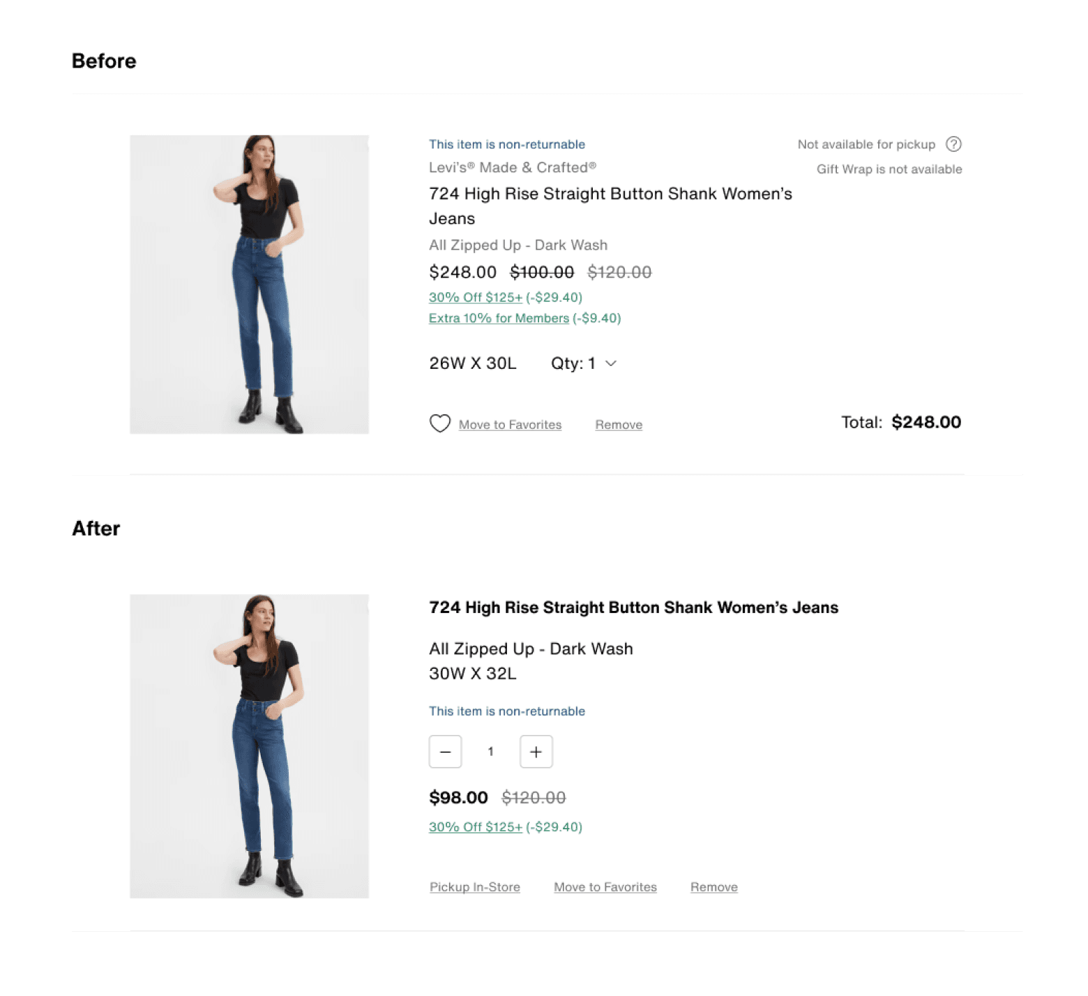
Increased the size of the image size significantly making it easier to compare and more proportional to it’s importance.
Items require excessive scrolling
Reworked the pattern to be more successful on mobile screens, limiting wasted space and condensing information to it’s most important parts. Regrouped information into categories that should also decrease the need to scroll.
Content is duplicative or irrelevant
Removed information that wasn’t useful or repetitive.
UPDATE: Last minutes changes after we officially reviewed with stakeholders:
• Added icons back to the action bar so the favorites action matched across the site.
