Applied Promotions in Checkout
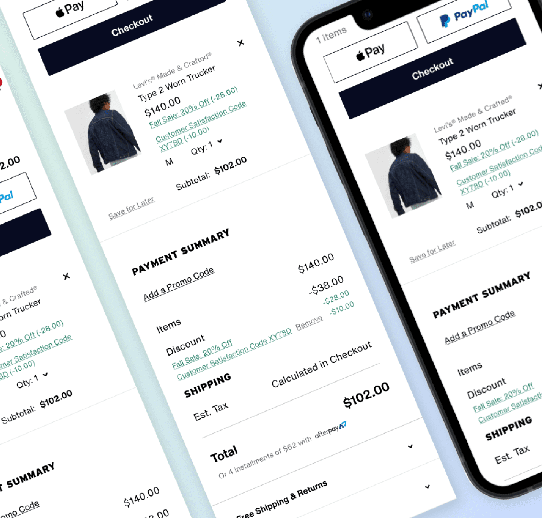
Redesign of promotion and discount information to alleviate customer pain points.
DEC '22 - JUNE '23
LEVI STRAUSS
Problem
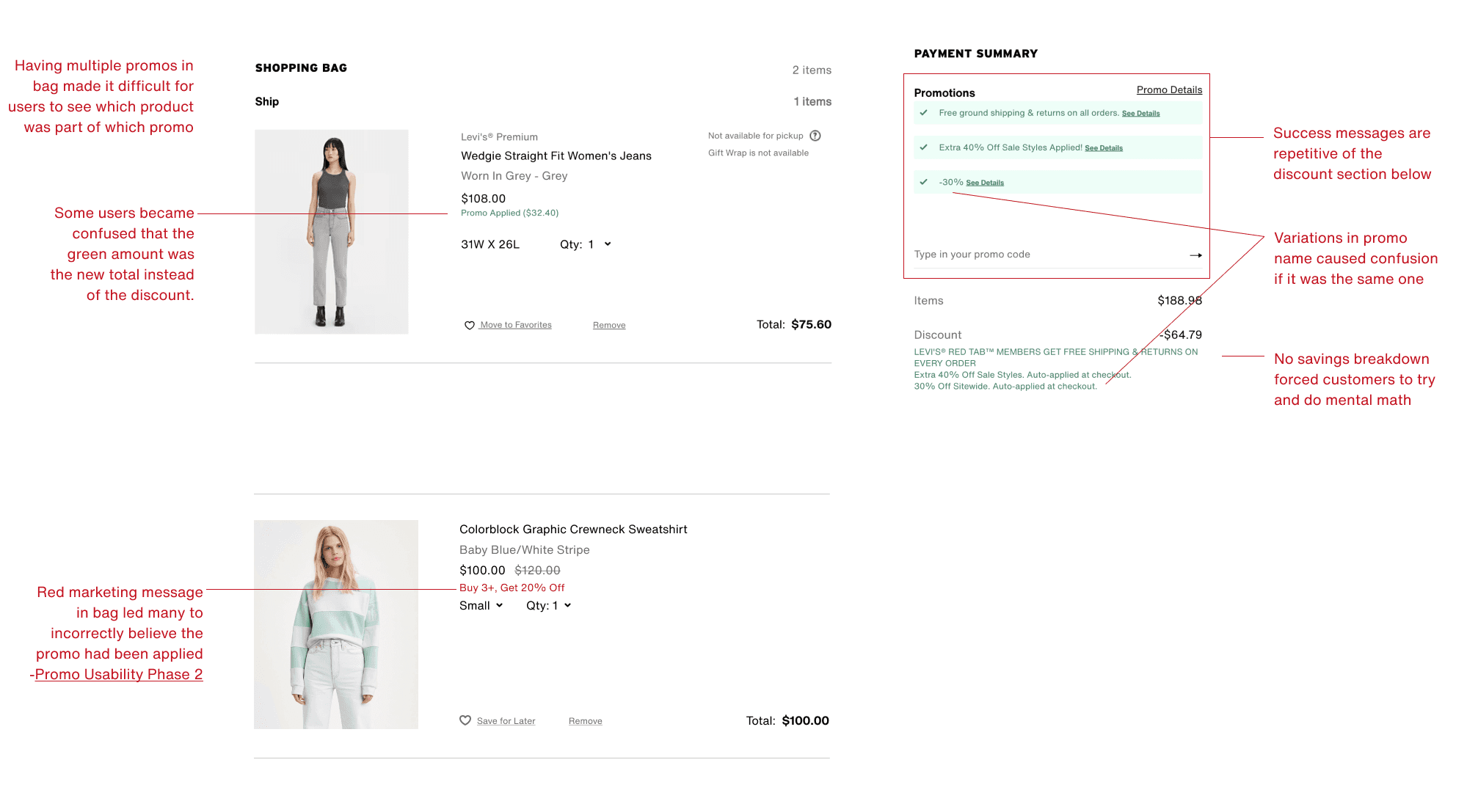
Consumers motivated by promotions ran into various difficulties in trying to understand their cart before wanting to purchase:
what promos were applied and to which items
how much they were saving
Overview
Before this project was officially kicked off, the site purchase team had gathered months of feedback from users ranging from comments from our customer satisfaction survey as well as user interviews and 3rd party usability audits. From those inputs our team including a Product Manager, UX Lead, and UX Researcher agreed on top problems to focus on, the biggest theme of which was confusion around how promotions are applied and understood in cart.
Metrics
Checkout success rate
Cart success rate
Customer Satisfaction Score
Pain points
Users had problems understanding which items had the promotion applied and why. Confirming both the correct application of promotions and their savings was an important step toward purchasing. This was hard to do with our original design.
Solution
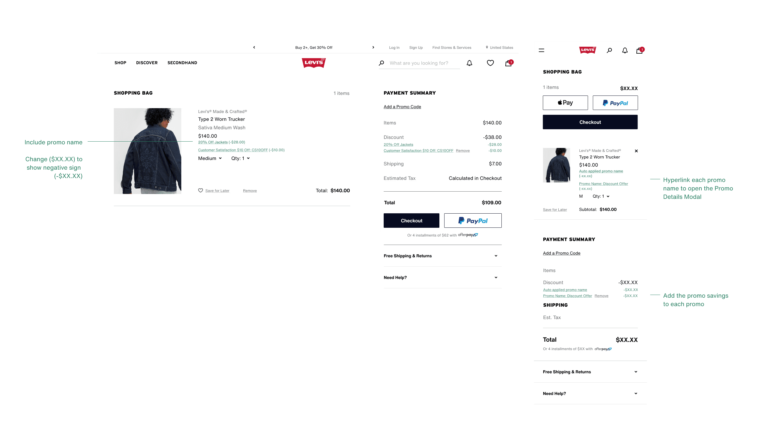
Despite some relatively simple design changes, the application involved large scale collaboration across multiple teams and changes to the promotion system (Hybris) which impacted the process the promotion team used to set up new promotions. Many months of collaboration and eventual training of the new setup, we finally launched in summer of 2023.


